First I made the logo. Once this was aprouved by everyone. We talked with Kevin Richard (director of the events) and Peter Moffit (american intern-copy writer) about the concept of the new campaign. We have created two concept, first was “BE stronger” and the second “City of Big Shoulder”.
For more informations I recommend to read the Text in the bellow wich explain everything about the logo and the two campaign.
Peter wrote this to get more value when we showed this to the others people in the company. This day , when we showed for the first time our idea, all of us were so exciting and so stressing out. Because without this agremment nothing will happen. I need to say that I really liked to create this with them. It’s what I prefere doing. Create the idea and build it. This is the best moment. I enjoyed to use Avedon’s picture. The pictures that I used for this was just there to show the idea. Of course, when we argue the new campaign, we also talked about a futur colaboration with a Photographer. They were so happy about what they have seen. I was so glad. For sure, they choose the second one “City of Big Shoulder” as we knew. Because this one is more easy to sell, more comercial but I like this as well. I think it’s interesting to have in the background , the idea of Chicago which is called “City of Big Shoulder”.
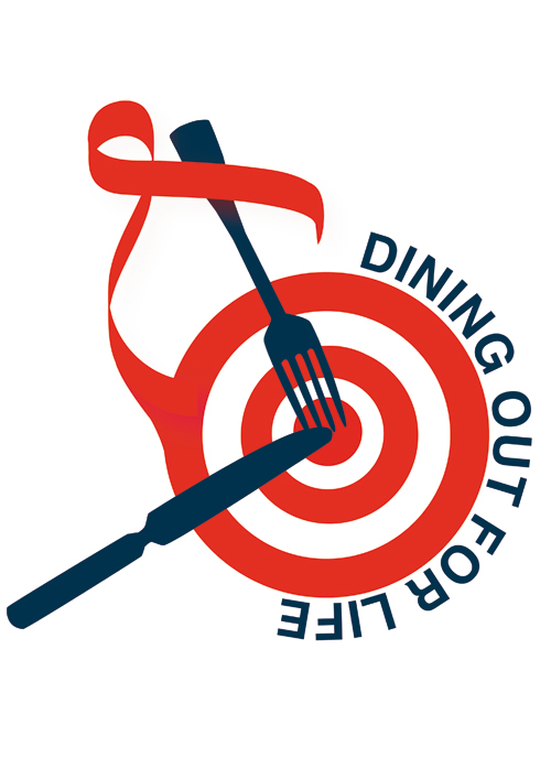
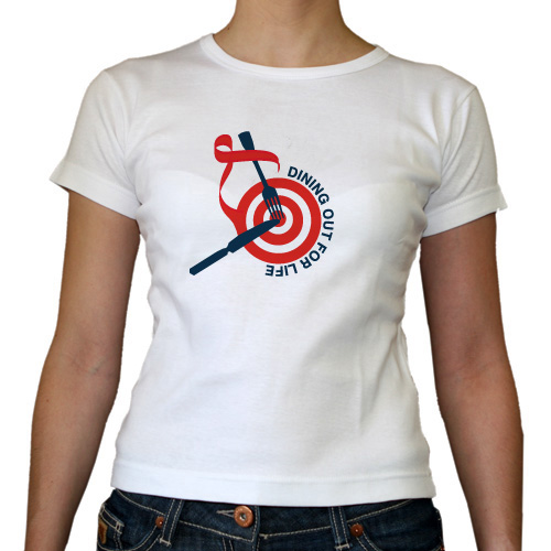
Chicago: City of Broad Shoulders- Dining Out for Life Logo
The logo is composed of two parts. The target/ribbon (red) symbolizes the fight against AIDS: this is clarified by the AIDS ribbon that grows out of its side. The dining aspect (blue) of the event is signified by the silverware, used in place of darts, with both utensils pointed at the bull’s eye. The central metaphor is that Dining Out for Life is aimed at the fight against AIDS.
1- Campaign
“Be Stronger” Campaign: Strength/Conviction/Struggle/Engagement
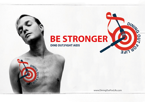
Composition: Figures in the campaign will be primarily solitary, and viewed from the back or side. The back is important because it (a) presents a broader space for the logo, (b) allows for more interesting poses, (c) can be easily adapted for strong positions. With regard to the side angle, the figure could flex his or her arm in a strong manner. Faces may or may not be visible. The essential starting point is that the image must be a representation of strength/a strong person in a physical sense: other interpretations would follow from logo/text.
The logo would be used as tattoo on back or shoulder of the figure. In some cases, it may be necessary to change out the color of the blue text, generally on a case-by-case basis. So far, white has proven to be a reliable option in darker photos.
The logo will be complemented by the tagline “Dine Out, Fight AIDS” as well as an additional slogan characterizing the campaign: “Be Stronger.”
Significance: The significance of the campaign is that the idea of strength is conveyed on a number of levels. At its most basic level, the image conveys the idea of physicality, Chicago’s broad shoulders, etc. The addition of the tattoo adds a conviction to “join the fight,” – the mission of Dining Out for AIDS is essentially internalized by the figure. He or she is literally wearing a badge/symbol on their arm. On another level, the slogan “Be Stronger” adds a certain unexpected connotation. The audience is invited to strengthen themselves both physically in terms of food, and more importantly, to realize their own strength in joining the fight against AIDS.
Impact: The full impact of the campaign comes from its unique approach. It emphasizes strength, both physical and personal. It is thought-provoking, in that the image is not clearly relatable to eating. However, with the addition of the “Be Stronger” slogan and the “Dine Out, Fight Aids” tagline, this connection is made clearer, and the campaign itself becomes more significant.
Audience: We believe that the target audience would be people from 20-50 years old, working people, and people who would be willing invest time and money in the fight against AIDS.
2- Campaign
Big Shoulders” Campaign: Carrying/Caring/Support
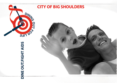
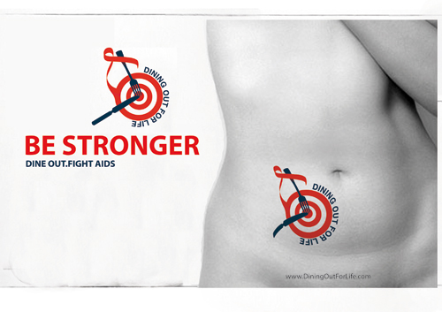
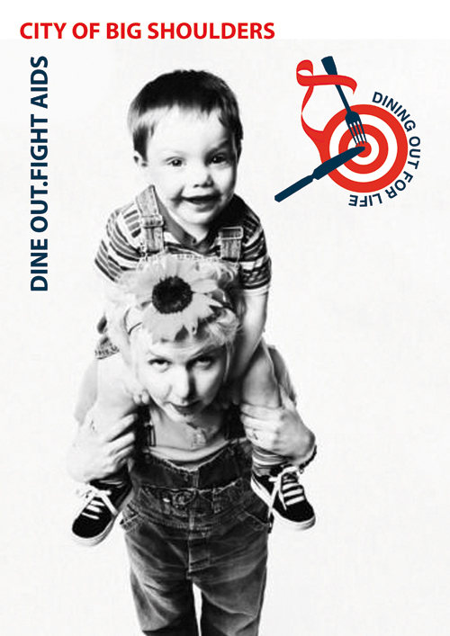
Composition: In contrast to the “Be Stronger” campaign, the figures included in the “Big Shoulders” campaign will be in groups of at least two people. Our starting point will be the exchange between two individuals. In cases where space allows, we will expand to larger groups. This is the great strength of the “Support” campaign, as dining is a communal experience, as is the fight against AIDS. The figures’ postures would emphasize the idea of carrying/supporting someone else. However, supported individuals will themselves have their own visible strength.
The logo will not be used as a tattoo, and will instead be used as a stamp, superimposed over the image (without obstructing it).
The logo will be complemented by the tagline “Dine Out, Fight AIDS” as well as an additional slogan characterizing the campaign: “City of Big Shoulders.”
In cases where many figures are being used in a single image, the composition will be dynamic and varied, rather than regular and static. Spacing between individuals will be irregular; figures will be of different height and in different poses, etc. This “tableau” composition underlines the goal of Dining Out for Life as an event that impacts many different people of all races, ethnicities, ages, genders, etc. all over Chicago. The fight against AIDS has universal significance.
Significance: The campaign will be exuberant and playful, stressing that fighting AIDS and supporting others isn’t just a duty: it is truly a joyful experience. The figures are elevating each other, and providing each other with a spiritual boost. The “City of Big Shoulders” slogan is taken from
Carl Sandburg’s poem “Chicago.” The slogan is an incredibly rich expression with many different meanings. On the one hand, it denotes strength. On the other, it denotes support. “Big Shoulders” describes Chicago as a brawny, powerful, dynamic working man. We expand that meaning to introduce the idea of a supportive shoulder, i.e. lending our strength to those who need it.
Impact: The impact of the campaign comes from variation and repetition. We will use the same idea of carrying and supporting, but expressed in a variety of different poses and compositions.
Audience: We believe that the target audience would be people from 20-50 years old, working people, and people who would be willing invest time and money in the fight against AIDS.
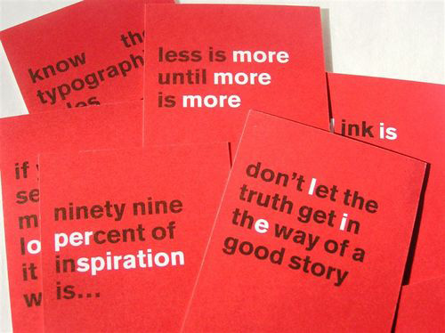
We are going to create postcard with the poem Carl Sandburg’s poem “Chicago.” “City of Big Shoulder”
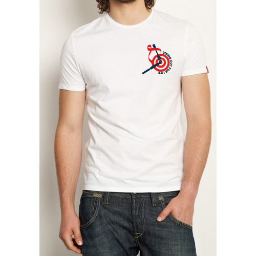
Men’s t-shirt
Women’s t-shirt
